systems
celebratory
Emotion
propaganda


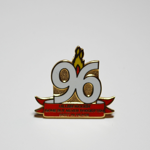
The saddest charpet of the club's history is told within this badge. The number "96"
represents the 96 fallen fans during the Hillsborough tragey of 1989. The eternal
flames, seen in the middle, were included into the club's logo following the
end of Liverpool's centenary year - 1992.
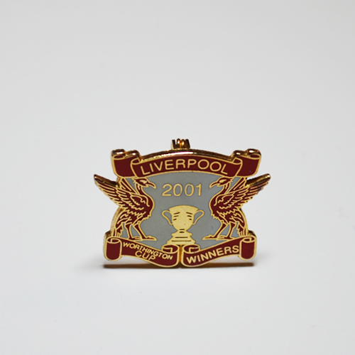
A winner's badge, which depicts the old Worthington Cup, now League Cup,
surrounded by two liverbirds. Oddity: neither of the birds seem to have any seaweed.
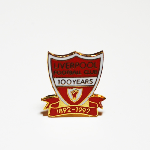
The official logo was changed to this form in 1992 - the centenary year for the club.
The logo was in use for only a year, before being updated with the eternal flames,
and the top ornament.
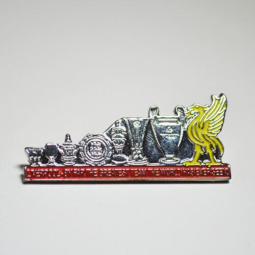
Next to a nicely highlighted liverbird is the set of all trophies the club has ever won,
and there aren't many trophies that aren't listed here. From left to right:
Worthington Cup, UEFA Super Cup, FA cup, Community Shield, Cup Winner's Cup,
UEFA Cup, and the UEFA Champion's League.
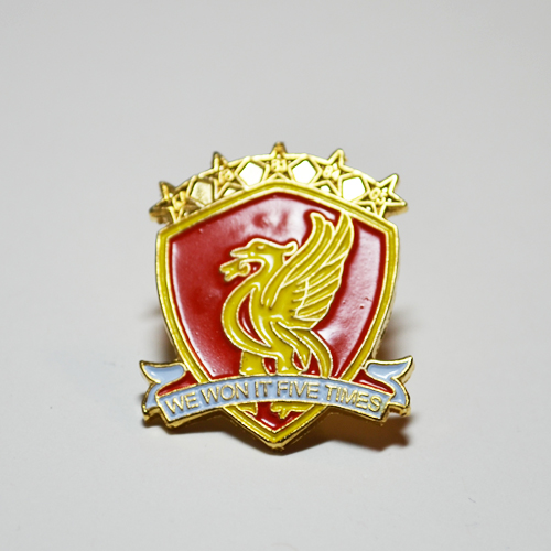
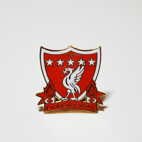
A different interpretation of the logo, which in this case includes the five stars
which represent the club's European successes.
Lorem ipsum is a dummy text used for prototype testing!
Lorem ipsum is a dummy text
Lorem ipsum!!!
This interpretation was only used in the metal industry, never making it to print.
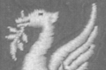
An artistic take on the liverbird motif. Here, the bird can be seen in the same pose
as seen at the home of Liverpool FC, however instead of a soccer ball, the bird
is standing on a Europe-favouring globe.
An artistic interpretation, which mixes up specific elements from the original logo,
accenting the importance of the liverbird.
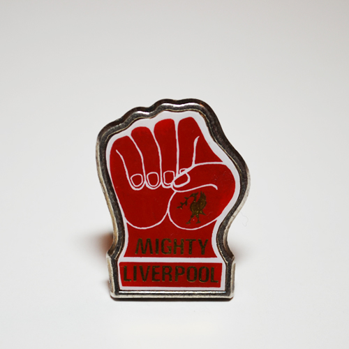
An old badge made by the famous Coffer company. The style is unmistakable - the bold
metal, the colors, the symbols. The fist is a clear representation of the might Liverpool
posed in their glory days of the 1970s and 1980s.
Liverbird was originally a symbol of the city of Liverpool, while the seaweed in its
mouth is a reference to how the original town of Liverpool grew to be a city –
naval arts. The symbol was chosen by the newly formed Liverpool Football Club as
their logo.
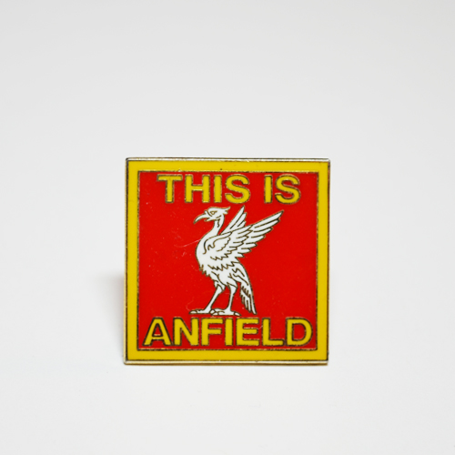
The famous "This is Anfield" sign in the form of a badge. The sign was created during
Bill Shankly's reign as the club's manager in the 1950s-1960s. Quoting the man
himself, the sign "... is there to remind our lads who they’re playing for and to remind
the opposition who they’re playing against"
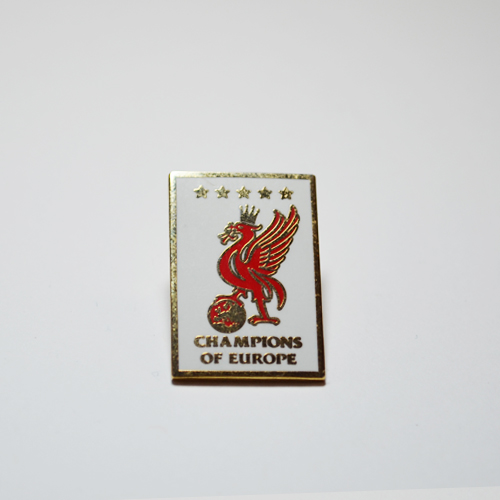
Bird and five stars. Signifies Liverpool's European heritage.
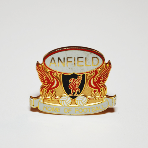
The liverbird takes the main stage in this badge as well. Here in three copies!
However, the main motif here is "Anfield" – Liverpool's stadium. The phrase "Home of
Football" is indicative of the importance the club pays to the game of football.
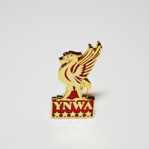
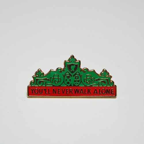
Another feature for the liverbird, however here the focus is also on the letters
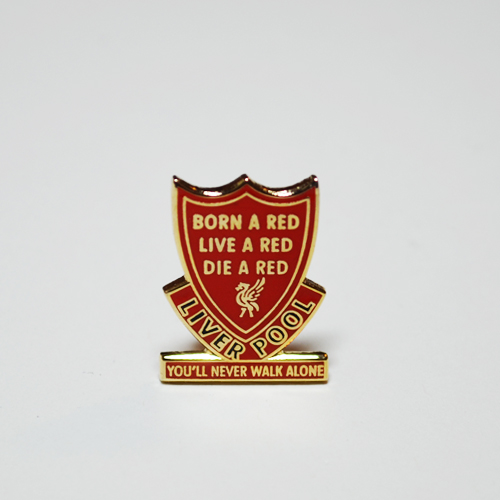
YNWA – the club's motto. YNWA stands for "You'll Never Walk Alone", and is a tribute
to Bill Shankly and the great progress he had brought to the club.
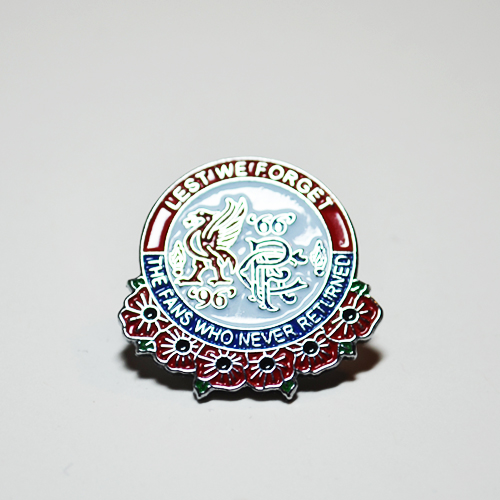
A beautiful symbol of solidarity between two clubs that have suffered a similar tragedy
where their fans have died - Liverpool's Hillsborough tragey of 1989 taking
96 lives, and Ranger's tragedy at their own stadium Ibrox, which took 66 lives.
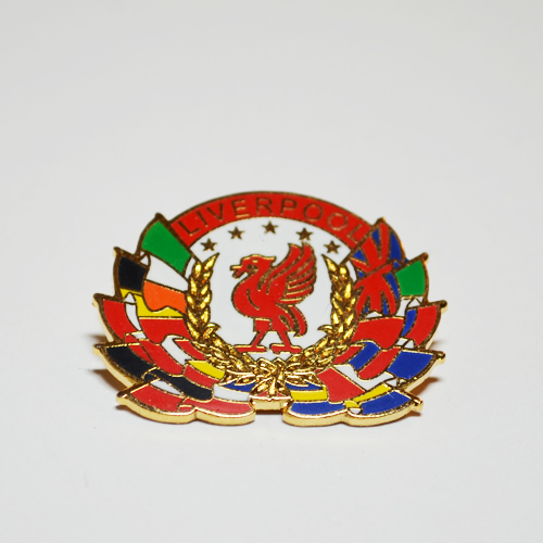
Another feature of an olive wreath, this time after the club's fifth success in the
top European competition. The badge also features flags of multiple European
countries to underline Liverpool's successes over many clubs from many countries.
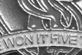
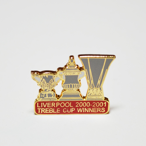
An enamel badge, which depicts the very succcessful year 2001, when Liverpool won
(from left to right) the League Cup, the FA Cup, and the UEFA Cup.
Lorem ipsum is a dummy text used for prototype testing!
Lorem ipsum is a dummy text
Lorem ipsum!!!
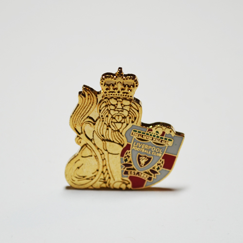
Being a club with such tremendous heritage, Liverpool FC are proud to be from
England. Here, the due tribute is paid with an intricate depiction of the English lion,
holding an England-flag themed shield, with the LFC logo in the center.
Taking on the theme of the club's logo, the creator of this badge has only one
messsage to send to the World.
An interesting version of the logo with the double liverbird. This version of the logo
was used in some commercial production, mainly for promotion purposes.
Another example of the Liverpool club paying a tribute to their country.
A wonderfully done enamel badge, which commemorates the Liverpool's successes in
the top European competition. Use of the strip on the bottom makes a strong
connection with the original logo, while the numbers within the stars correspond
with the years of the club's victories.
Yet another tribute from the club to the nation. Here, however, the Great Britain's flag
is also included.
Another example which focuses on the eternal flames - club's tribute to the fallen 96.
Advertising that, judging by the background of the shield, is aimed at the Englanders,
perhaps those outside of Liverpool.
The logo version seen in this example is a rare one due
to it's rather unconventional coloring. The inspirational emotion here is pride - therefore the stars.
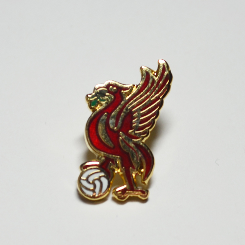
The liverbird with a football. End of story.
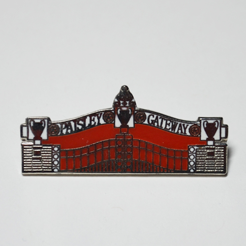
Depicted here is the Paisley Gateway, in memory of Bob Paisley, who was the club's
manager after Bill Shankly resigned. Paisley would go on to become the club's most
successful manager, having won the top European competition three times.
Three championship cups are therefore depicted on the gateway.
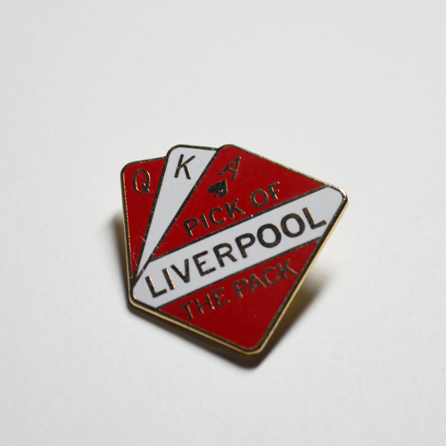
Advertising by making a reference to universal objects. Play of words is also present.
Use of porcelain is a rather rare occurance within the sport memorabilia collections,
but this piece is a wonderful example of a different coloring applied to the logo.
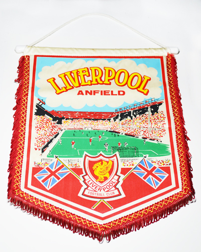
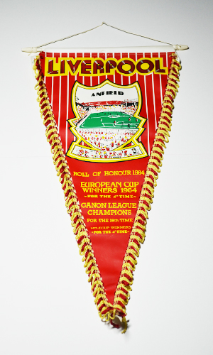
This old pennant is not only one of the more uniquely shaped ones, it was also
produced by hand. Obvious signs of the screenprinting process are visible throughout.
A contemporary pennant which clearly represents the revival of the old-forgotten logo.
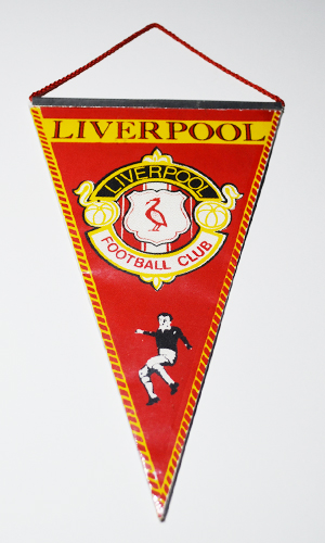
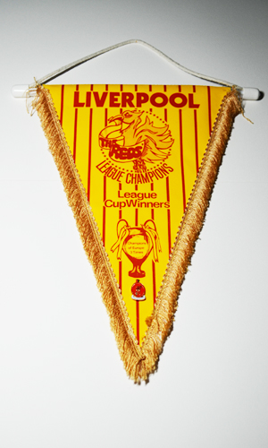
This pennant is old - one can tell so by it's structure - solid metal bar at the top,
with printing done on cardboard-like material. It also features the older version
of the logo without mentioning any achievements, meaning that it was made
before the victorious days of the club.
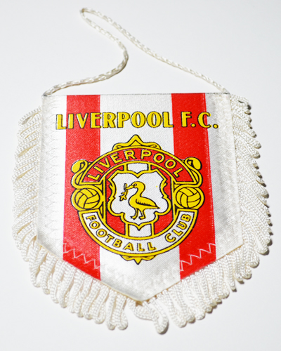
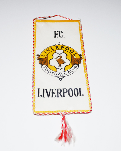
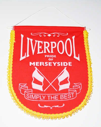
Cloth is yet another popular material within the sports memorabilia enthusiasts.
Here, the logo makes a strong effort to emphasize the bird, and together with the
British flag and the word "Liverpool" point to the pride Liverpool F.C. takes
in being the symbol of English football.
Propaganda at its best.
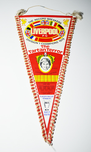
Propaganda again, as the pennant shows the true might of the club, making a
reference to "The Tartan Terror" in order to fill an enemy with fear.
A very colorful pennant which celebrates the club's most recent (at that time)
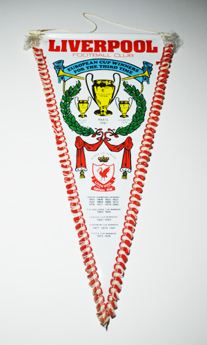
European championship. Trumpets, raised curtains, olive wreaths, and a crown.
Doesn't get any Royal than that.
A vinyl pennant that glorifies the successes of the year 1984. The logo is
present only through the outlined shape, in which the club's staduim is depicted.
By this point of time Liverpool have amassed so many trophies, the logo doesn't
even need to be shown.
A rather unique interpretation of the liverbird. Self-explanatory.
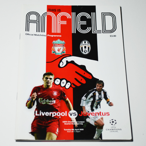
This contemporary programme features a symbol of solidarity - handshake - between
the two featured clubs. It has grown upon the tragic events of the Heysel tragedy,
which happened in 1985 and took lives of 39 fans at a final which took place
between Liverpool and Juventus.
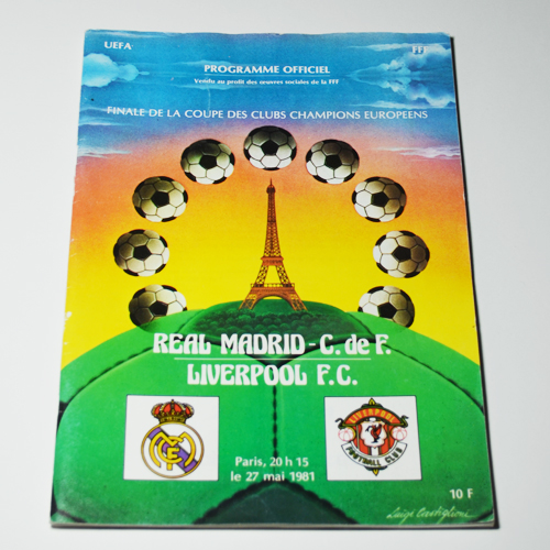
The logo used on this final programme is an outdated one, that was mainly used
during the fifties, after which it was forgotten for a period of time. This is one
of the examples of that version's revival.
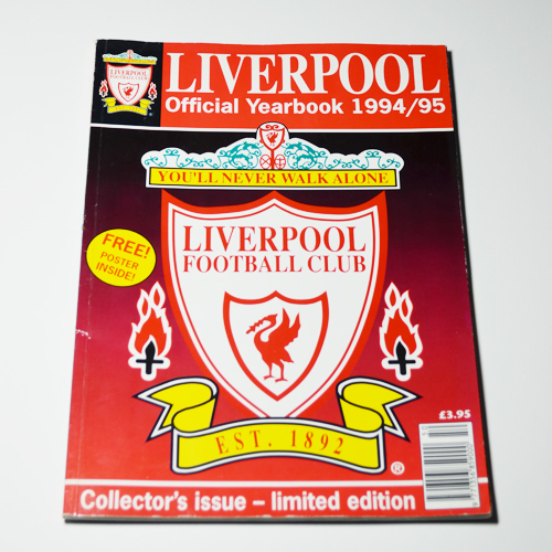
This version of the 1993 logo was adopted specifically for this limited edition
yearbook. Differences between this edition and the original can be seen in the
thickness of the green ornament at the top of the logo, the eternal flames, and the
curve of the yellow strip at the bottom.